
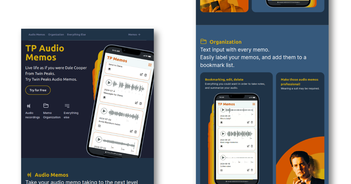
Recently I took elements from two freelance jobs I had finished and used them to create a new demo project. I ended up creating TP Audio Memos, which is a Twin Peaks-inspired audio memo-taking web app. One of the more difficult things - near impossible maybe - I encounter when approaching web design is starting with a blank canvas. Without some kind of framework for the design it can become very difficult to come up with a convincing, professional looking website. However, even though I have no background in design, other than what I have taught myself through following general principles, the freecodecamp web design course</a>, and my sense of what looks right, I think I have started to come up with some original web designs.
In this case I took the general outline for the page flow from emedici.com and adapted this in several ways to the point where it looks quite original. If you consider the basic flow of elements on the page, this is a pretty standard software as a service landing page. The top-most section has the hero section with the call to action button and a big picture of the web app on a smart phone. The middle sections feature sales points for the product, and the last section is a final call for signups and/or subscriptions. I think if I didn’t have this kind of framework for how to place the elements on the landing page, I would have been stuck in some kind of web design purgatory.
Just as a basic principle minimizing color usage can stylistically unify the design. There is probably a goldilocks zone somewhere between over-usage of colors and under-usage. Also from a UI, UX persepective, the colors can also take on a role to subtly indicate what the function of an element is. This is often clear in style frameworks such as Tailwind or Bootstrap in which there is typically a color code for “danger” level buttons in red, and more neutral buttons using green, for example.
In my TP Audio memos web app, I started to use three color shades; yellow, light orange and a darker orange, as a simple way to fill what would otherwise be blank screen space between elements. What resulted was a pretty retro 60s-70s look. Personally I quite like this retro look harking back to 60s-70s design aesthetics within a contemporary web design. The whole thing has a facetious professionalism inspired by the TV character, Dale Cooper, who was often seen using a audio recorder in Twin Peaks back in the early 1990s. For a more comprehensive look at grooviness take a look at the groovy patterns on Adobe Stock: https://stock.adobe.com/search?k=groovy%20pattern
The CSS Blob!
Afer realizing the groovy path I had taken in web design, I realized that what I really needed was an animated blob near the final call to action to completely seal the deal with any potential users. If I were trying to do this two years ago, I would have jumped straight into Javascript to do the animation without thinking. But, now I am more wise in the ways of CSS, I have realsed CSS is the way to go here. For a blob that is contained within the flow of elements in the web design, animation keyframes in CSS is probably the easiet way to get a looping animation working.
See the Pen retro blob by Gareth Perilli (@gperilli) on CodePen.